

Both were bought, knife-trimmed, resculpted and finished in January, quite a bit before my birthday.
The clay I used was Fimo Air Basic, and it's... good, but not ideal for customizing; it gets shaped nicely and is as strong/weak as this kind of clays always are (not to compare with epoxy at all), but when doing large areas it's not very friendly. Just look at those horses I am going to tell about, their clay edges are too visible. I don't own anything to sand them down, and that even isn't an option when you have sculpted hair texture. I'm not good at using modeling paste, and it didn't help with that despite trying hard. Maybe I do something wrong. Or, definitely, I DO something wrong here. I already decided that I have to fix that finnhorse's barrel, but I really don't know how... I'm not going to add clay there since it could ruin his paintjob. It needs to be something that doesn't mess.
The first one was a TWH gelding who was just another one of that mold to become a finnhorse. I haven't finished any of the previous ones, so I was happy to see how this one did so. I kept it simple and didn't modify his position, just whittled his nose and ears off. That maybe was the reason why he finished so quickly, as there wasn't much need for extra pauses to wait clays to dry.
 |
| In the left is one TWH-going-finnhorse with terracotta Krea clay. |
And what comes to the clay, I just surrounded this horse with it... I added so much as I wanted and needed to make him both to look like a finnhorse and also to make him look a bit bulky, older and food-loving gelding. That is a traditional horse for me; that one you can go to roam in a forest with.
I also tried hard to make the forelock hair to lay nicely and not as stupidly as I am prone to do that. With manes overall I tried to test a new technique: I smudged it to the surface like if I resculpted a body part, and added the hair texture only after that. The main reason to fade the hair ends is to make it easier to paint later.
What comes to his paintjob, I had good time trying to decide which color he should be. Finnhorse is a very colorful breed despite being usually chestnut; it's just common, but not the only option possible. I still decided to do a chestnut, since I love that type of color and it's variations. Recently I've been liking delicious types of dark/liver chestnut, so decided to paint this as one - the decision got fed by a fact that I've made few dark chestnuts already ages ago around 2010, so it finally was a time to see how I could to do that as I'm an adult and more experienced with painting!
 |
| Middle and pangare tints added to the body. I use dry brush technique to shade limbs. |


A brown horse is not just a plain brown, but it has tints. I love that fact, though I'm prone to overdoing shading so I have hard time knowing where my horse is going when finished. Also, as I use acrylic paints only, it's tricky to fade the color changes nicely. With this finnhorse I developed a new technique that I can finally call a working one: I use a small brush and very little color at once, and smudge the colors quickly without cleaning the brush between that. I only occasionally dive it to the water bowl to avoid the common disease called "don't let the paint dry to your brush". And no, I don't thin the paint at all. I trust in the small amounts and the fact that a thick paint, when used carefully, will work well when you really paint it as flat as possible.


Here's a example of his face progress:
 |
| Base color, no details. |
 |
| Lighter paint, pangare, added. Later he got yet darker layer of brown dry brushed to his face. |
And here he is finished, with the OF TWH.


I decided to name this finnhorse as Koppis, referring to his failed barrel sculpt (that what needs to be fixed). Koppis, koppakuoriainen, means a beetle, and we know that their front wings (the harder surface is a modified pair of wings!) don't smoothly blend to the body. Just like this poor horse's barrel clay. The name also matches his color, which is important.

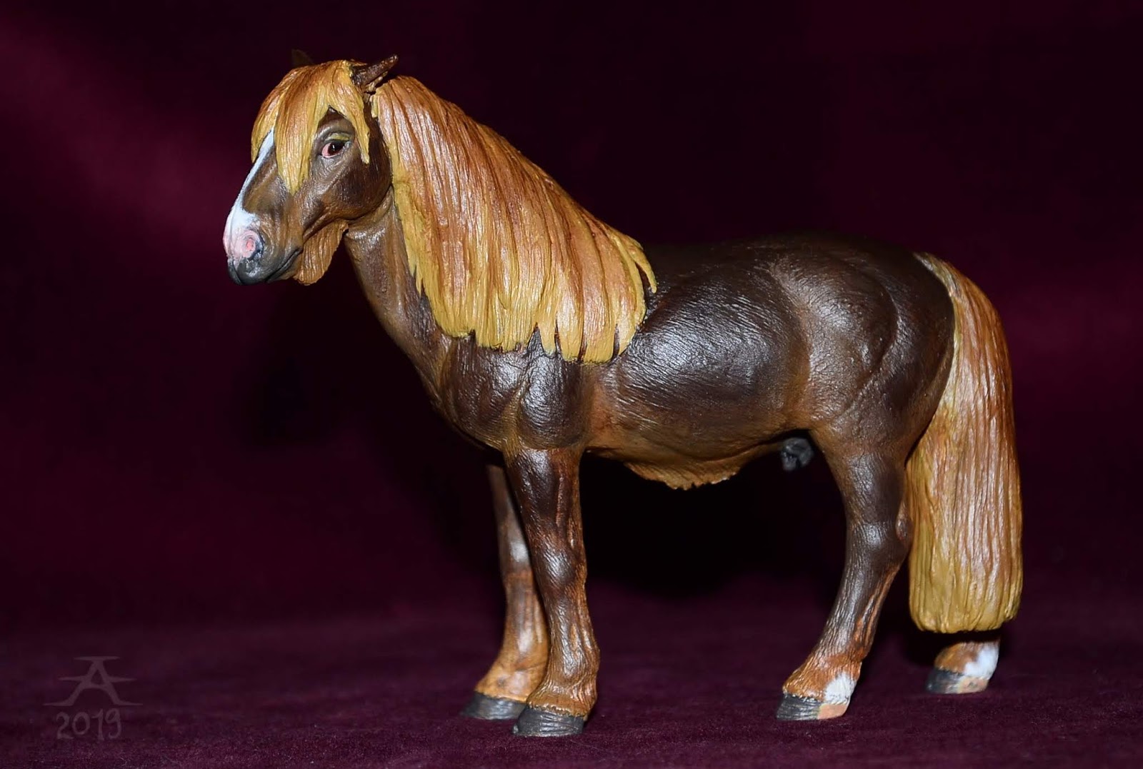


Face details... It's luck that his face sculpt doesn't show any serious issues, so it's fine. The problem area is only in his barrel. Because - that face is something I've tried to do for long time, and I wish Koppis has the 'finnhorse expression' that you don't see in other breeds. In my view it says "sorry that I do exist, but I do my best anyway".


Onto the friesian then. For a long time I've planned to do a custom on the standing friesian stallion mold, and this time I actually made that happen. I tried to correct all the clearest errors of the mold, so I needed to change it's barrel shape, neck, face, expression... I resculpted the whole mane and tail just to see how I success with trying to do wavy hair texture for the first time ever.

When the painting time got closer, I struggled to decide what kind of black I am doing from this horse: a sunfaded black (meaning it's actually brown), just a black (too simple) or... blueish black? I sticked with the last idea, and realised that this was my time to do something I've wanted to paint for a looooong time. And I don't see blue horses very often in this hobby, since everyone prefers super realistic coloring.
To do it as well as I can, I added a bright blue basecoat... And was late to capture it with the camera, since I hurried to finish the horse; I better finish than wait just for photos to happen. The blue paint gave him some extra grainy texture since it wasn't really liquid (so I tell, NEVER buy paints that are not liquid in the shop... I bought this and few other bad paints ages ago since I know the brand is good, but these bottles seemingly contained stuff that wasn't okay). I needed to wet the 'paint' a lot with water to really be able to paint it like you do with a liquid color... Well, that wasn't so bad, since it forced me to add thin layers...
 |
| The contrast isn't that harsh really, I just like to exaggerate everything with my camera... Or then I don't know how to photograph at all. Also that paint isn't that shiny, aagh. |


Black paint - this time it was semi matte satin acrylic by Mont Marte - is awesome. You don't need more than one or two layers of it, really, and still it allows the undercoat to show through. That was what I wanted. Another thing is, that when the black is the main color, it's just easy to fix errors like when a mane color doesn't stay where it should. It gets fixed just by adding some black paint there, and no need to worry about ruining the body shadings.
My friesian got blue mane and tail, and also feathers. I also added some blue to give him subtle pangare, which got carefully overpainted with black again. All his colors are black and blue except the eye white, which is actually red, as well as that red spot in both of his nostrils. Even his hooves are blue, though looking very grey - that was the last time I use that bottle I bought 10 years ago... It was already a bit dry for use.
Here he is with the OF stallion.


Face comparison. I know his nose is huge, but I could just... call it a style. At least a piece of some drawing style I developed ages ago and almost grew out of after focusing to very realistic horses. (Which brings to my mind that I should scan a lot of drawings that are my visualizations of what to sculpt or paint... All about miniatures. This friesian was one I planned on paper, and that is the last time I do that for my model horses.)


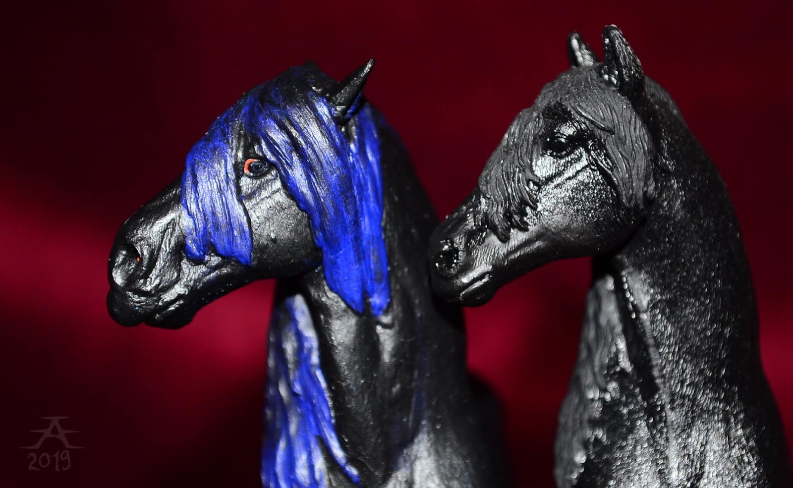
My blue friesian got called as Earl. I wanted it to tell something of the time he was finished, and it was just an accident that the word 'early' needed to drop one letter to become a matching name. He definitely looks slightly vampiric, I say...I also got an idrea that I need to redo him in traditional scale someday, as he just got too much character to stay as a Schleich only. And I think he would need mane and tail (and feathers?) made from mohair or viscose (or yarn) since that much clay hair would just limit the use of tack. Maybe I learn to sculpt someday.


I have difficulties to decide which of the photos I leave off from the blog... I seemingly made a horse who I like to photograph. It's mostly a good thing - but Earl looks shiny in these, which he really is not, and the light behaves badly.


I lost my self-control when moved to take headshots, and... Just played with lights, flash, mirrors and the horse's expression. I didn't get what I exactly wanted, but these will be just OK for now.


It seems that every model horse has their better and not so better side, and with Earl the better side is his right. One factor may be that I don't have a flash that is separate from the camera, so it has a role how I hold the cam.But really, his face is sculpted worse in the left side.


 |
| This light was caused by placing the horse very next to a large mirror, which reflected the flashlight strongly. |


I want to post some new tack later. It's in traditional scale.
