
I figured out that I really don't enjoy repeating my painting sessions in mind and in form of text, so I will simplify it greatly (which usually leads to an ironically large amount of text). This means that I'm not giving much of a word about details in the progress my NaMoPaiMo horse went through.


First of all, I failed my attempt to try to blog about this weekly. I just can't do that, it's proven true now. Another problem is the "update" Blogger did some time ago, I just give up blogging or at least uploading photos on pages and articles which already have some. Nothing in this thing makes sense, and to be honest, no one wanted it to happen. A table computer user with keyboard is still a thing, me being one.
Anyway. Here's the progress in one single post!
I started with three horses from some Breyer stablemate painting kit: an arabian, a mustang and the peruvian paso, the latter being my official victim. The mustang served as a test piece for techniques and the arab was just a filler. The test piece was to make sure everything went okay, because I didn't want any serious setbacks, and because he helped me to avoid wasting paint and also was a good secondary canvas when I waited the official horse to dry between layers.
First layers were difficult, when it comes to the paso and mustang, because their base color was going to be something between yellow and orange (eventually going red). The arab was nice to work on, and I basically just layered black gesso on him so long that he of course became solid black.
 |
| First actual color... I nearly wrecked my nerves when I had to layer this endlessly, it was so diluted. |
 |
| Second color, again several layers to make it actually visible. |
 |
| The mustang got the same treatment. |
 |
| First color and second color. Both were so liquid that they were more like watercolor than acrylic in consistency. (I used a palette knife to put water into each; a small plastic spoon could serve as well.) |
I ended up using a wide row of more or less small brushes, which most likely are artist quality. I also tested the brush which came in the Breyer kit, just to see if it's worth use in this kind of work. Yes, somehow. But it also left clearly rougher brush stroke texture when compared to my better synthetics, which I found interesting; this happened even when the paint was thinned enough.
 |
| I can't photograph properly sometimes, or then my camera doesn't like brushes. (He's old anyway and could use some repair.) |
For basic body color I used a flat brush with rounded edges. These can be made at home by trimming the corners off from a rectangular flat brush, so, no need to exactly hunt for one. (I always moist the brush before trimming and use the scissors 'against' the bristles, which makes it more controllable.)

Because I'm me, and I like white faces on horses, and black combines well with sabino or splashed white, the arab was the first one to look worth recording. I had more fun with him than my actual victim, which was kind of worrying, wasn't it?
 |
| He should be getting a white face, hence the lack of layers there. |
I never threw off the package plastic which my palette came with, and it serves as a lid which protects the colors from drying too fast. This is how I stored the paints between use:
 |
| I do who knows how many kinds of crafts, and it can be seen literally by looking at my worktable. Not sorry. |
Once I also sketched down the white markings for my NaMoPaiMo horse. I'm a visual artist who has drawn their entire life and have studied art too, so one could assume this could have been easy. No. I'm incredibly bad at drawing or painting from reference photos or even objects under my nose, and even more so when I should draw something certain like a breed of horse or an individual or a position. It always fails, so I didn't care if I did justice for the actual mold or not what comes to my ugly sketches. And by the way, before sketching I read a lot about white markings and especially sabinos and Googled a lot of photos. The final markings were roughly sketched from several images I saw, but eventually turned out very different (which is positive).
 |
| The notes are in Finnish. And I HAD to smooth out the darkenings just because... |
I definitely blocked the basic areas for markings already on this stage. It's the ugly stage you can see here - and it lasted long!


The mustang got some leg color blending attempts after I read painting articles from the Braymere Custom Saddlery blog. Despite that, I had zero idea what I was doing. (And I've read some of those older articles several times over the years, just because they've interested me!)

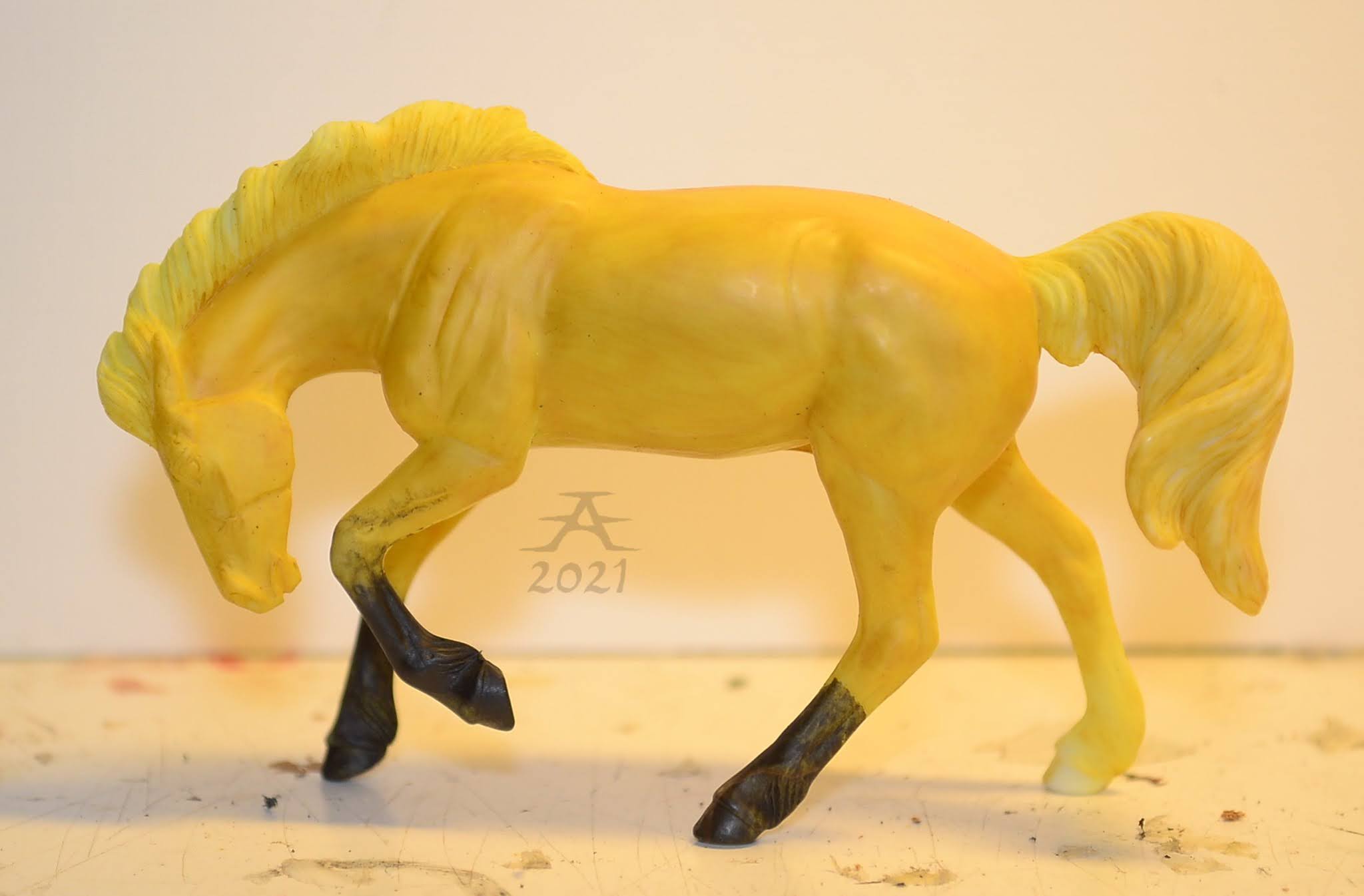
Finally got rid of the ugly bright yellow. It looked similar to what onions smell like... I connect smells, colors and tastes and other sensory things. Nothing to worry about, just neuro stuff.
 |
| An orange on legs. |


I like orange. The horse could almost have been left this pale, but since NaMoPaiMo colors are commitments, and I committed for a red chestnut, then it had to be red and not orange.

This was when I got a box from Lahjakas, one Finnish dealer who sells more Breyers than any other store in the entire country. A good excuse to not paint.
 |
| One of the models that box contained. |
NaMoPaiMo horses went forward. Enough said. Although I could also mention that the next color was the first actual red, and I thought it could show in the final result. Also added more layering to the white markings to make sure they don't disappear.


Then I suddenly had three shades of red and orange to use. This was the step when I was down to layering shadings and tones on, or in my sense, counter-shading and darkening. I mostly blended the colors by using wet-on-wet technique or something similar, and more or less ignored the hair growth direction for the sake of practicality. The brush I used for this was a small one with flat hairs and corners trimmed off, so it was rounded. Let me say that it's one of my favorite brushes, I always use it for blending!
 |
| Orange, reddish orange and red... |
 |
| One of my favorite brushes, the blending king. And yes, he's totally nice to use despite how broken he looks. |


I also used some of this to add pangare to the arab, in the logic that he could become a brown. (Which as a horse color name doesn't make any sense, in my opinion. In Finnish we call that black bay.) He reached the most magnificent ugly stage I've ever seen, maybe. This is why he isn't finished. Yet.

Then came another box, this time from USA, in fact from Jennifer Buxton! She had a birthday giveaway in her blog, and I won for my surprise (I happen to be a pessimist...). Second excellent excuse to procrastinate with painting - I am very pleased with this box. Among the Nazruddin I got little extras, from which one was a booklet about white patterns by Lesli Kathman. It felt absurd to be able to just read English on paper without the need to translate more than a few words here and there! Everything arrived safe, and Nazruddin found his place among my herd. Will take some photos at some point.
 |
| A booklet! A sticker! And an exploded worktable! |
Back to the topic.
My paso went further, and had at least three shades of red on, white markings briefly blocked and... That was it.


I did not bother to record more steps after that, because I started to need to hurry. But the further I write, the more steps I remember and want to mention. Too bad I don't have anything to illustrate these.
One of those things were the mane and tail. I did the body color and skin first and most of the white markings, then gessoed the mane and tail. Then I mixed the light yellowish color for mane and tail, thinned it down and applied in several layers. The narrow areas I did with tiny pointy brushes and usually let the color slip over to the body surface. This was okay because I then later fixed these slips with the body colors, which I kept useable just because of this. Once the yellow was as I wanted, I mixed a lot of water to the orange which I used for counter-shading, then applied that on the mane with a narrow flat brush. The paint was so diluted that it mostly filled the crevices but didn't cover anything else that well. That brought the mane's texture more visible, just like I wanted. After it dried, I applied some of the base yellow back on the more outer areas.
To finish the white markings and to add details in them I used my smallest brushes. I always say that I will not do anything hair-by-hair, but that is exactly what I have done for white markings in some of my horses... Let me say, it was rather odd to feel that every brush was too large and the paint was too liquid to get full control over what I did. Unthinned paints are easier to control than this stuff. And this scale...! Didn't help when I yet got an idea to try to paint so that the hair growth direction could be visible. Fail.
I signed the horse by using one of the colors I used for him and a brush which has unusually long and narrow hairs. I use it basically just for this purpose, because it gives really, really narrow lines. I got that brush ages ago from a friend and a fellow artist.
The sealant was applied only after that. I thinned it down and applied in a couple or more layers, not sure if it serves at all, though.
His eyes were scary to do. I have never painted anything so small,
other than the irises and pupils in my dolls' eyes (in some cases). I
must have trimmed one of my tiniest brushes so that there were even less
hairs, because, you know, it wasn't small enough... And I never learn
how to do horse pupils in a way which doesn't go completely wrong. Had
to redo one of them.
Anyway, here is a photo of all the brushes I used with this horse:
 |
| Centimetres (and millis) up, inches down. |
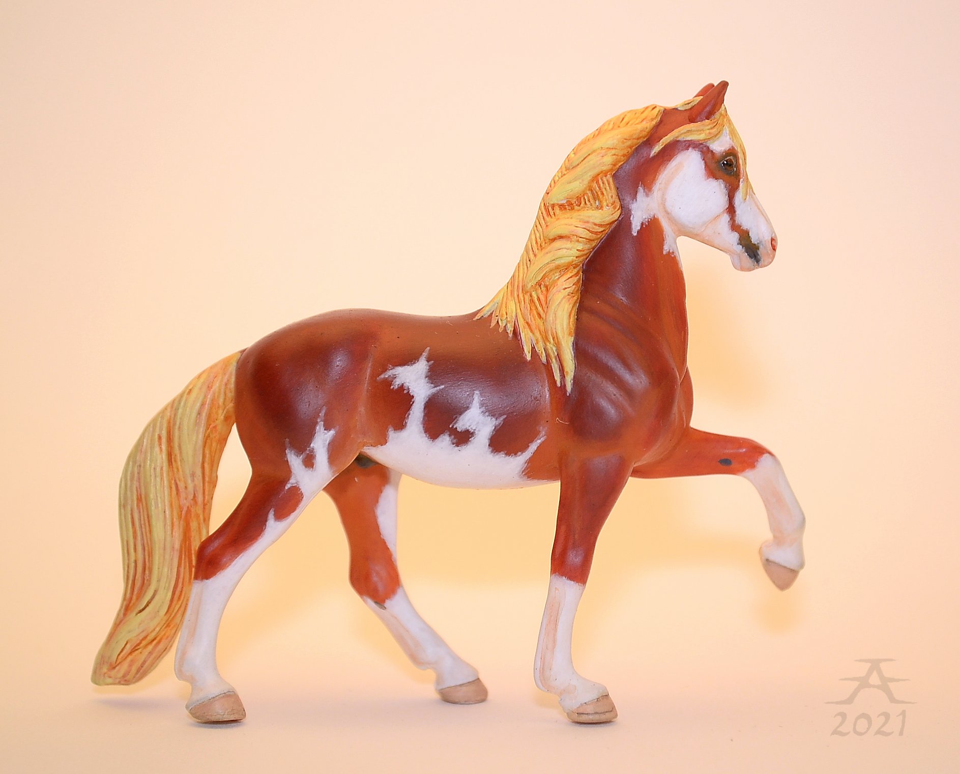
And how did he turn out? He should be a flaxen red chestnut sabino, but I seriously don't know if I wrecked the sabinoing or not. It's not a whitening type I'm that familiar with, unlike splashed white (alias Finnish pinto). Anyway, I am quite okay with how he turned out, especially for a first horse-looking stablemate I've ever painted.
I had to photograph him in two different settings, since his color really IS so bright and contrasty that it can look dull in average settings. I never know which really serves so variations are practical.
These pics were taken in a small studio box which I have made from a traditional scale Breyer's package. It sits on my table under a work lamp, and because that light is yellowish and bright, I have placed some household paper on top to soften it. And I forgot that I have made "mirrors" from another package part and foil... Despite using flash by default, I managed to get the colors turn out more orange than I wished, so had to adjust the tones afterwards.
First I took photos with a setting that will make colors bright and also bring some contrast by default. This is mostly close to what his color truly is, it's not exaggerated. This horse is literally a red chestnut.


Just in case, I also snapped a few basic shots with the average brightness and contrast. In these the colors aren't as strong, and actually the horse looks less red than he really is. Usually it's easy to do the other way around! One of these was what I posted to the completion page (mostly because some people said the contrasty ones hurt their eyes).


Headshots were taken too. These are again contrasty.

 |
| He looks scared. |


A new horse always needs a name. I talk a lot with Kave, my co-blogger, and we quite suggested a name after name. Eventually I didn't know whose horse each was meant for, but well, it was fun... She used fixative on her model and I didn't, which helped me to find a name for mine. Far From Freezing Feb Fixes.
It doesn't make sense more than by connecting the month to the horse and by telling what I could have used if I had that as an option. Yet less it will be acceptable for a peruvian paso name. I've played with languages when naming things, but my actual grammar skills are limited to Finnish and English (and maybe minimally to some other languages, like German and Swedish...?), and I recently got enough of trying to build a sentence name from a language I don't understand. That is why it is English this time. Also, my horses are not going to reach showing in any form, so I don't even care. Hah.
I remember finishing him on the 27th day, and the calendar read that it was the name day of Torsti. Therefore I decided that it can serve as his nickname. The name's colors match enough to the horse's warmth and sharpness (the sabino!), that will be it.
All I can now say is... I did it! Officially!
 |
| I also got to use my most recent signature/watermark on paint for the first time. It combines the initials of my full real name into one "logo". |
Aftermess:
Did I learn anything? Yes. I experienced painting a stablemate. This horse was my first one of the scale since before 2011. My paintjobs back then were terrifyingly rough and I didn't even care if they were done properly, let alone realistic. And no need to say that the models I painted then were just some cheap toys. I have evidence:
 |
| Most of these were painted (and resculpted) somewhere around 2010. The draft in red harness may be from 2014? |
I learned that scale matters. If I need to thin out the paint a lot, I will definitely prefer bigger scales. Thinned color will be slurped in much higher in the brush than unthinned, which made it hard to control the amounts, I think. It was annoying, although not very dangerous because such a watery pigment was possible to just wipe off if there was too much of it. Unthinned paint could be layered much faster due to it covering better, but stablemates are too small for that; it will eat details of the sculpture. It's no problem with anything bigger than Schleich, to be honest. And no one has to agree with me.
 |
| This mare's body color was painted with acrylics which were thinner very little or not at all, and I had no problem with it. |
I also simply don't mind a paintjob which looks "painted", literally. It can have some subtle brush strokes, but not in the sense what you can see in my oldest paintjobs. Maybe the term "texture" fits better. I just don't mind if everything isn't blended to the point of an airbrush look... This kind of painted-like paintjob is most likely easier to do well on a horse which has more surface for proper techniques and paint consistencies.
Maybe I'm just trying to justify myself the fact that I can never reach the photorealistic paintjobs' level, but overall, I don't even expect my own work to reach those levels. It doesn't mean I couldn't want quality and realism.
Will I paint more stablemates? Yes. But my prefered scales will be bigger.
 |
| Not my best in either resculpt or paintjob, but you can see the directions of my brush. And that is what I don't mind. |
What about NaMoPaiMo and me experiencing it? I'm pleased, although I didn't feel like I painted with others any more than usually. I do my hobby crafts in a small room without digi devices, except camera. I also wished I was able to update everything in time, but that is technically impossible and is always going to be. This is a human who doesn't have and will not get a smartphone and who also does not use Facebook, Instagram or other popular somes. I'm a blog and Discord person.
But NaMoPaiMo in general... It's wonderful and awesome. And Jennifer Buxton is great person and one of my hobby idols. The best thing was that I realised I now was one of the painters, not just a person who reads about it and sees all that community stuff happening. Participating a challenge really does feel totally different from being just a sideviewer!
